PROJECT / 2022 / LINKÖPING UNIVERSITY
medieteknik.nu
Rebuilt the official Medieteknik program site for Linköping University with a modern App Router stack and Swedish-first UX.
- stack
- TypeScript · Next.js · Tailwind CSS · Framer Motion · Vercel Analytics
How it works
JSON content
values and carouselNext.js
App Router, Swedish firstdevices
drag and type adapt
01 / Overview
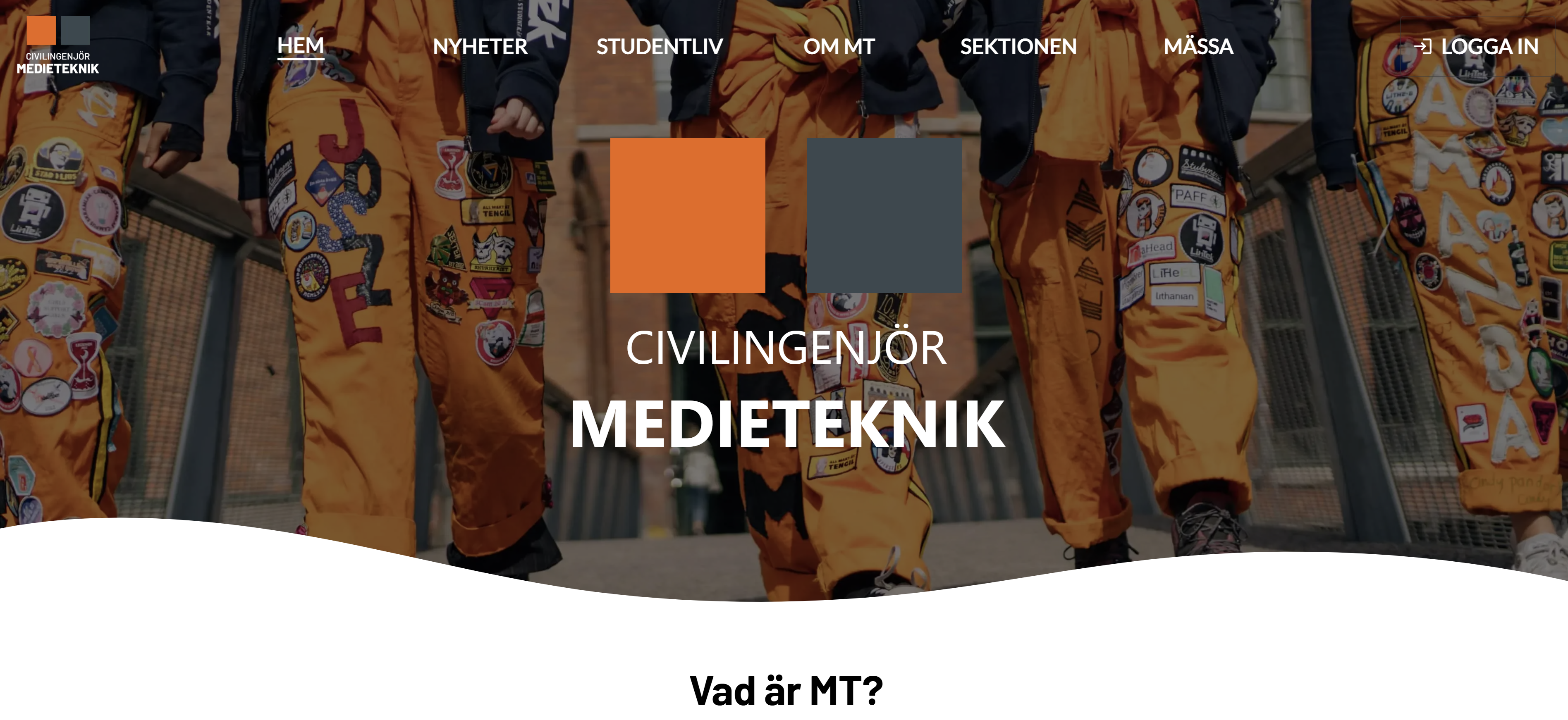
A refreshed Medieteknik program website built on Next.js 16 (App Router), React 19, and Tailwind CSS 4. The site is written in Swedish, optimized for mobile-first browsing, and highlights program values, student life, and Medieteknikdagen with interactive motion cues.
02 / Key features
- –Draggable hero cubes: Framer Motion drag interactions sized dynamically per device
- –Mobile-aware layout: MobileStateProvider drives typography and component sizing
- –Values grid: JSON-driven cards that summarize program pillars with imagery
- –Student life focus: Highlighted sections for Nolle-P and links to associations
- –Event CTA: Medieteknikdagen block with external registration link
- –Carousel + wavy separators: Motion carousel with themed background transitions
- –Analytics: Vercel Analytics and Speed Insights wired into the layout
03 / Solution
Built with Next.js 16 App Router and TypeScript, styled with Tailwind CSS 4. A MobileStateProvider tracks device breakpoints to adapt drag targets and typography, while Framer Motion powers the interactive cubes and carousel. Content (values, carousel items) is loaded from JSON for easy updates, and Vercel Analytics/Speed Insights are wired through the root layout.
04 / Outcome
Delivered a Swedish-first, responsive experience with motion-driven hero cubes, carousel storytelling, and clearly segmented sections for värderingar, studentliv och Medieteknikdagen. The mobile-aware context keeps layouts legible across devices, and analytics provide insight into engagement after launch.